Rehabilitation Through The Arts
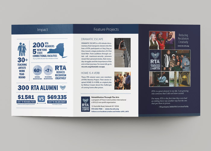
RTA’s ongoing success is dramatic: less than 3% of RTA participants return to prison within three years, compared to the national recidivism rate of over 60%.
Challenge
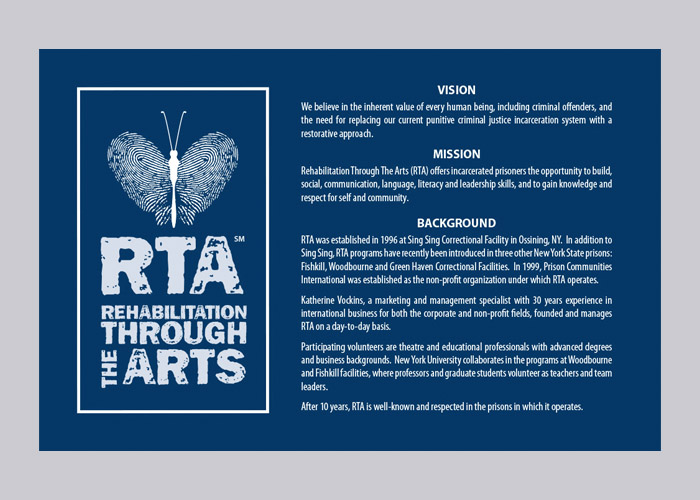
Rehabilitation Through the Arts (RTA) is a nonprofit that uses theater, music, dance, writing, and visual arts to help incarcerated men and women build confidence, communication skills, and a path toward positive change. Their work is deeply human, emotional, and transformational, and they needed a brand identity that captured both the strength and compassion at the core of their mission.
Solution
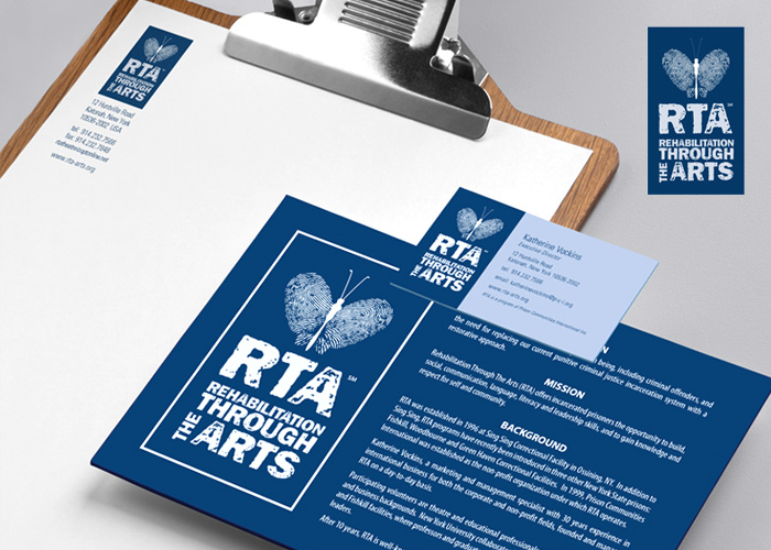
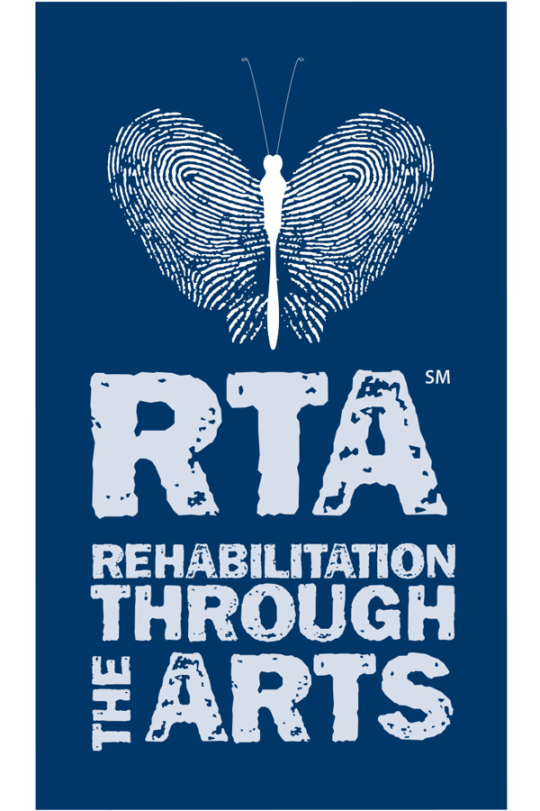
When RTA asked me to create their new logo, I couldn't wait to get my hands on it. Quite literally! The butterfly wings were created using my own thumbprints, a symbol of transformation, growth, and change that perfectly reflected the organization’s purpose.
To balance that softer, more human element, I paired it with a bold, distressed typeface that brought grit, strength, and resilience to the design. That contrast became the heart of the brand: tough but compassionate, strong but personal.
The final mark became more than just a logo. It gave RTA a visual identity that truly reflected the life-changing work they do every day.
Results
RTA has grown into one of the most respected arts rehabilitation programs in the country, with a recidivism rate of less than 3% for participants. That statistic alone speaks volumes about the impact of their work. Seeing the logo continue to represent the organization across performances, programs, merchandise, and national recognition has made this an especially meaningful and lasting creative partnership.
"Throughout the years, I witnessed how finishing a drawing, learning a dance, or performing a role in a play gave incarcerated men and women a new sense of what is possible."
Additional Work for RTA